Navigation Styling Guide
IN THIS ARTICLE:
eCatholic is excited to share our styling guide for eCatholic ChMS! We hope that these changes allow for easier, more user-friendly navigation through the platform. As you explore this layout, we want to point your attention to several key details.
Church Menu
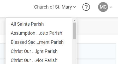
eCatholic ChMS now has a church menu, located in the upper right corner. When users are in the ChMS, they can look to the upper right corner to see which church database they are currently within. Users tied to multiple church databases can now easily switch church databases by clicking the down arrow next to the church name. They will see a list of all their church databases and can click whichever church database they want to enter. (Users are still able to switch church databases, if desired, by clicking on the eCatholic ChMS logo in the upper left corner and seeing the Dashboard of all their church databases.)

Navigation Menus
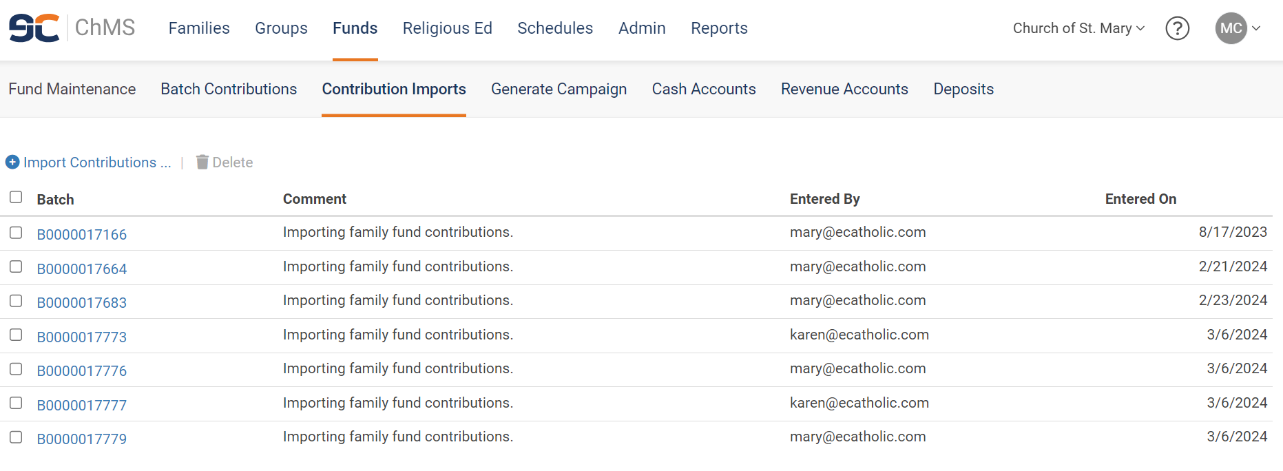
eCatholic ChMS now contains both a primary and a secondary navigation menu. When you click on the primary menu, moving from module to module, an orange bar will underline the name of the module that you are currently in. To change the module you're viewing, simply click the name of the module you want to view in the primary menu.

The secondary navigation menu appears in gray underneath the primary menu. In the secondary menu, an orange bar will underline the name of the page that you're on within the particular module. To change the page you're viewing, simply click the name of the page you want to view in the secondary menu.

Contribution Imports
In the Funds module, two features - Import Contributions and Pending Imports - have moved to the new Contribution Imports page.

To import contributions from an online giving platform, click Funds > Contribution Imports > Import Contributions, and then follow these instructions.
To clear pending imports, click Funds > Contribution Imports and then click the Batch whose contributions you want to clear. You can then follow these instructions.
Reports and Actions as Buttons
With these changes to the navigation menus, the Reports page will no longer by dynamic - containing different report options depending on which module the user is within. Instead, clicking Reports in the primary navigation menu will open up to the Report Library, with the option to also move to the Dashboard via the secondary navigation menu.

Different report options that would previously populate in the Reports drop-down menu are now available as buttons within the different modules. Additionally, different Actions that were previously available in various drop-down menus are now available as buttons within the different modules.
Buttons in Families Module
In the Families module, the Family Register report now appears as a button toward the top left of the Family Explorer page.

For Diocese Administrator users, the Family Giving Analysis report appears as a button toward the top left of the Family Explorer page - rather than the Family Register report.

Buttons in Funds Module
In the Funds module, the Fundraising report now appears as a button toward the top left of the Fund Maintenance page. This button is grayed-out and inaccessible until the boxes next to one or more funds have been checked.
INSERT UPDATED SCREENSHOT WITH GENERATE CAMPAIGN ADDED

Additionally, Generate Campaign now appears as a button on the Fund Maintenance page. This button is also grayed-out and inaccessible until the boxes next to one or more funds have been checked.

Buttons in the Religious Ed Module
Several reports have been added to different pages in the Religious Ed module. The Confirmation Register and First Eucharist Register appears as buttons toward the top left of the Registration Maintenance page.

Also in the Religious Ed module, the Class List report and Attendance Sheet report appear as buttons toward the top left of the Class Maintenance page. These buttons are grayed-out and inaccessible until the boxes next to one or more classes have been checked.

Additionally, the Promote Students action is now a button that appears on the Level Maintenance page.

Buttons in the Schedules Module
In the Schedules module, the Busy Weeks report and the Scheduling Report now appears as buttons toward the top left of the Service Maintenance page.

Additionally, Generate Schedule now appears as a button in the View Schedule page.

